Friday, January 31, 2014

Character #3— Ludwig van Bathoven

Having done three (and soon, four) books about bats, there's an assumption that I live in a world of bats—that I'm a bat expert, that they're my favorite animal, etc.  That's not really true.

Although I've been fascinated with them since I was a boy, watching them fly over our backyard during long summer evenings, the real thing about doing the bat books is that I enjoy spending time imagining a night-time world in which the things we humans do is turned upside down.  The bats are a great blank canvas of characters through which to look at human activities in a different way.

One odd thing about being associated with bats is that everyone wants to offer up a bat joke, or more often, a bat pun (and most of them are excruciatingly bat. ——See what I mean?).  One guy who has cropped up again and again in jokes since Bats at the Beach was published in 2006 is Ludwig van Bathoven.

When I was working on Bats in the Band (coming in August), I thought Ludwig was going have a large presence in the story.  But somehow he never made it into the final cut.  I figure he's got to be seen at some time, and as we begin to gear up for the launch of the book, it might as well be now.

So here's Ludwig van Bathoven, a tortured musical soul.
Most who knew Bathoven were familiar with his foul moods—but very few knew that his volatile outbursts
came from frustration at only being able to play two notes at once.

Friday, January 24, 2014

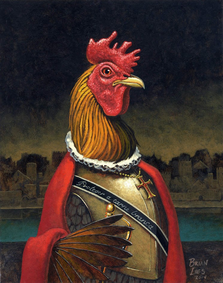
"Finish Friday:" It's Vasco da Pollo.

So, it's Friday, and here's the intrepid explorer, Vasco da Pollo.  I like how he turned out.


It's funny how the mind brings up ideas when you're not expecting it to—as I worked on the finish for this bird, it occurred to me that the best chicken explorer name of all (see "Vasco da Llama," in my last post) would have been. . . Marco Pollo.

But I was already underway with this sketch, and with a color scheme in mind, and so I continued.  Maybe farther down the line, Marco Pollo will appear as one of these pieces.

I was interested in doing a very tonal background, with the suggestion of a city, as you often see in early paintings or prints.  If this were for a book, I'd have taken the time to do the research on a city in India which da Gama might have visited, and shown that city as the background.  Here, I just suggested the buildings.

I also remembered that da Gama was Portuguese, not Spanish, so the motto on his sash now reads:  Proteger a carne branca (see the previous post for more on this).

As with the last piece I did for this blog, this original painting of Vasco da Pollo was auctioned on eBay.

Here are some process images for this piece:

1) roughing in color washes in acrylic over the sketch on paper.  In this case, I printed out a copy of the sketch, glued it onto Strathmore 500 Series board, and painted directly on the printout.

2)  More tones coming in.

 3)  Closeup of his head.  At this point, I was happy with how his comb was popping against the background tone.  You can see I've laid in some tones in the eye to give it a little dimension and personality.


 4)  Background complete.  Trying to keep it a suggestion, rather than a tight rendering.  It's there for "flavoring" only.

5)  Finally, work on rendering Vasco da Pollo.

Monday, January 20, 2014

Vasco da Pollo —Character #2

As I was finishing up the first character last week, I started thinking about what kind of character I'd like to paint next, and what animal he or she might be.  I thought an explorer would be fun, and then decided it needed to be a rooster (I'm eager to paint a rooster's haughty and challenging eye).  The name was easy:  Vasco da Pollo.

My next thought was that the character might be better if the name (and animal) were Vasco da Llama — it is a funnier name— but I'd already gotten an image of the rooster in my mind, and I'm not in the mood for a llama.  

I read an online bio of the real da Gama, and refreshed my memory that he'd been the first European to find an ocean route to India.  Like many European explorers of the age, de Gama could be a very cruel man.  But I was amused that the article stated specifically that the ocean route to India aided in Europeans' access to pepper and cinnamon. . . which go very well with chicken.

So here he is:
Vasco da Pollo.
His family motto, which I might inscribe in his breastplate rather than paint on his sash,
reads Guardar la carne blanca (Protect the white meat)

I want to make this one as tonal as possible, with grays and rich reds, and a suggestion of a far-off city in the background, a classic portrait touch.

Comments?  I'm happy to hear them.

Friday, January 17, 2014

Poor Richard / First eBay

I'm home from three terrific days of school visits in Pennsylvania, and was finally able to complete the character I posted last week.  So here he is.  Poor Richard is still thinking about his Legos, and not making any progress on the quiz.

And as promised, the original painting went up for auction on eBay.

I hope you'll come back Monday to see the next character (follow this blog to make that easy)!  I'm going to do my best to stick with my one-a-week goal, and I've already got Monday's sketch ready.
Unable to summon up any of the facts about Guatemala Mrs. Bennington taught them, Richard turned his mind to more pleasant thoughts of his Legos.

And for good measure, here's one last image of the piece in process.  You can see I've left the paws and final details in the face for last.  After I completed Richard, I went back and added smudgy eraser details in the blackboard, which I thought made it feel more dimensional.


Paws and facial details still left to do.

Friday, January 10, 2014

Real Life Interferes


First, a confession:  this week hasn't gone as I expected it to go.  I needed to finish sketches for another project I'm working on, and had some interesting stuff happen with an adult book my wife and I have coming out in September (more on that later).  My children's book critique group met on Wednesday.  And so here it is, Friday, and I don't have my finished painting for this blog, as originally promised.

I'm new to blogging, and maybe I'll have to readjust to doing a sketch one week, and a finish the next.  Life rarely goes as you expect it to.

So, instead of posting the finish today, I'll post some reflections on revisions, and some work-in-process images.  I'm off to visit some schools in Pennsylvania, so it'll be next Friday at earliest before I'll be able to post the finish of Richard at his desk.

Revisions.

An illustrator has to be flexible in terms of art direction and editorial comment.  Sometimes we want to dig in our heels and fight for something we really want, and sometimes, as in the writing cliché, (Faulkner?  Sir Arthur Quiller-Couch?) we have to “kill our darlings.”

When I invited folks to comment on my sketches here, I was surprised by the kind of comments I got. 

First was that I should make the head of “Richard,” the dog here, larger.  My impulse is to not do that, because in my mind, Richard is perhaps in third grade, which would likely make him eight years old, which would be. . . oh, 1 1/7 in dog years.  And I didn’t intend for him to be truly a puppy.  My gut feeling is that he’s at the start of that awkward not-a-little-boy-anymore, not-yet-smelling-bad phase.  So I’m choosing to not “down-age” him.

Second comment was Richard’s pencil grip, which one reader pointed out made him look like his paw had been stabbed.  I’d mentioned something about his pencil grip myself, so I knew that was something that I was going to need to fix.  Here's Richard with a re-sketched paw, with a new pencil grip.  I can't imagine his writing is going to be very neat!  I've also added a rough shape for his tail, and suggestions of a blackboard behind him.

One comment caught me by surprise, but reinforced what I’ve always believed as an illustrator:  there is always someone who is more of an expert than you are, and you need to do your research. 

“The ‘R’ in ‘Richard’ is incorrect.”  

It’s been a geological age since I learned cursive, and my own writing has devolved into a mix of cursive small letters and printed capitals.  I’d drawn a “fancy” R, not thinking about the audience of educators who might eventually see the drawing.  And, as the reader pointed out, the teacher would have made the name signs in Richard’s classroom.  So if this drawing were intended for a school audience, that tiny detail, that “R,” would stick out as wrong.  Our eyes pick up on that kind of thing.  And that decreases the reader’s faith in the authority of the narrative voice.

So:  research. The below is thanks to ( http://www.gmbservices.ca/Jr/Handwriting.htm ), proper strokes for a capital “R” :


Another comment was a question:  how are you going to show he’s thinking of Legos?

Actually, I plan to not show any Legos.  One thing I’ve learned is to let the reader do some of the heavy lifting.  If you spell everything out for a reader, then there’s no mystery.  Part of the magic of reading is that we bring our own lives to the stories we read, and so every person’s version of a story is different, and personal.  And that’s one reason the movie version of a book is nearly always worse—it’s been flattened down to the version of what the people who made the movie imagined, or thought we wanted to see.  Most people have seen a movie of a book and thought, “that’s not how I saw it!”

So Richard thinking of his Legos will bring different images to different people.  Me?  I picture just square and rectangular pieces, mostly red and white.  A young person now would likely think of all of the different modules of Legos available (such as Star Wars), which have turned Legos into something nobody over 40 would recognize.  So by not showing anything Lego related, the image becomes more universal than it would if I created a thought balloon, or painted a background of brick shapes.  Sometimes the best decision is what not to show.

Here are several process images as I work on Richard at his desk:

First, I cover the image area with a tone, usually burnt sienna and burnt umber.  This "kills" the white of the page, seals the paper so my acrylics handle better, and begin to set up the lights and darks of the piece.


Next, I filled in the blackboard area behind the character, which helped define his shape and started to give me clues as to the lighting in the final piece.

Here, I've painted in the desk and have begun modeling Richard's face.  At this point, he's looking very foxy, and not husky/wolfish.  That will change as I bring light into his chin area, making that bigger and heavier, and as I even out the color and highlights in his upper face.

More when he's finished!


Monday, January 6, 2014

First Sketch-to-Finish piece

If you've read my first post, on Dec. 30th, you'll know what this blog is going to be about.  Characters:  both ones I create, and ones in children's literature.

A quick re-cap first.  I'm going to post a pencil sketch of a new character on Mondays, listen to any comments/suggestions folks might have on the character, and do a finished painting of the piece.  On Fridays, I'll show how it turned out, and the final artwork will go up on eBay.

I'm looking forward to experimenting with color and techniques in a way I can't while I'm working under deadline pressure!

So here's the first victim character I'll take to finish:
Unable to summon up any of the facts about Guatemala Mrs. Bennington taught them,
Richard turned his mind to more pleasant thoughts of his Legos.

Looking at this sketch, I think I'll want to turn it into a square or horizontal piece—move Richard to the left, and show his tail raised behind him in a joyful way.  I think his right arm—pardon, paw— needs to be longer, and the way he's holding the pencil defined better.  But I like the look of mental drift in his eyes.  I remember certain times in school when I felt that way. . . though Legos weren't my thing.

Any thoughts?  By Friday, he'll be back on this blog in full, academically-challenged color.  Since this is my first full-fledged entry for the blog, I might also post some process photos, to show how I approach an illustration.

Have a great week!

Sunday, January 5, 2014

Out with the Old, In with the New

As I prepared to post the first sketch-to-finish piece I'm going to do on this blog, I realized I don't want to take the time to go to someone's blog to find just a single post—that's like checking out a web site in which every button leads to a declaration of "Coming Soon—Under Development!"

I'd prefer to see a blog with several posts on it already, so I'm going to post a couple more character pictures here before tomorrow's "first sketch" goes up.   And going with a New Year's theme, I thought I'd show two pieces, done a long time apart.

First, an old piece, from one of my art school sketchbooks (circa 1986-87):
The 1967 Spenburg sees that cute Porsche again. . .
This is Prismacolor black pencil with Dr. Marten's Dyes.  I liked the intense colors of the Dr. Marten's, but the colors are notoriously fugitive.  A test sample of all of my colors on a sheet of 8.5 x 11" paper in my studio for several years all but disappeared with exposure to daylight.  The only reason this isn't just a black-and-white drawing now is that it's been hidden in a sketchbook for more than two decades.


Then a more recent piece, done a year ago:  a pair of unfriendly skater gophers:

I never did like passing that corner.

I liked the squinty look of the guy on the left.  He seems like the mean one to me, the brains of whatever operation they might have, and the bigger one is likely his enforcer.